Advanced Form

The Advanced Form widget introduces a new way to build forms by giving you a flexible layout canvas instead of a fixed structure. Design forms the same way you design your pages, with full control over layout, spacing, and supporting content.
Perfect for contact forms, lead capture, signups, surveys, and more, this widget lets you combine fields with text, images, and other elements to create forms that feel like a natural part of your site — not an embedded afterthought.
Note: this widget is available in Editor 2.0 only.
Preview: https://demo.wocode.com/advanced-form
Tutorial Video
Setup
WIDGET PLACEMENT
- Drop the widget onto your site, and place it in a row where you would like the Advanced Form widget to be seen.
- Three options will be available, allowing users to modify the form steps, adjust settings, and customize the design.
FORM STEPS TAB
The Advanced Form widget includes two editable states and supports multi-step forms. Each step is fully customizable and can include additional widgets and content.
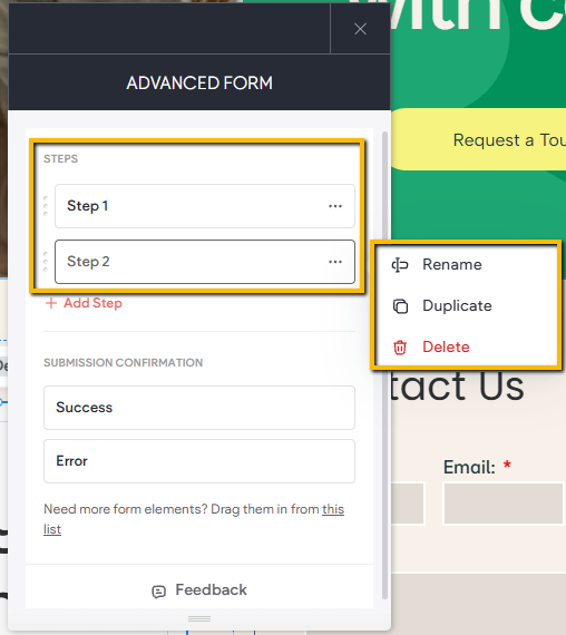
Steps
The Pages section lists the steps a site visitor will move through to complete and submit the form.
- A single-page form functions like a traditional form.
- To create a multi-step experience, click + Add Step to add additional pages or steps.
You can manage pages by:
- Dragging and dropping to reorder steps
- Renaming, duplicating or deleting steps using the three-dot menu
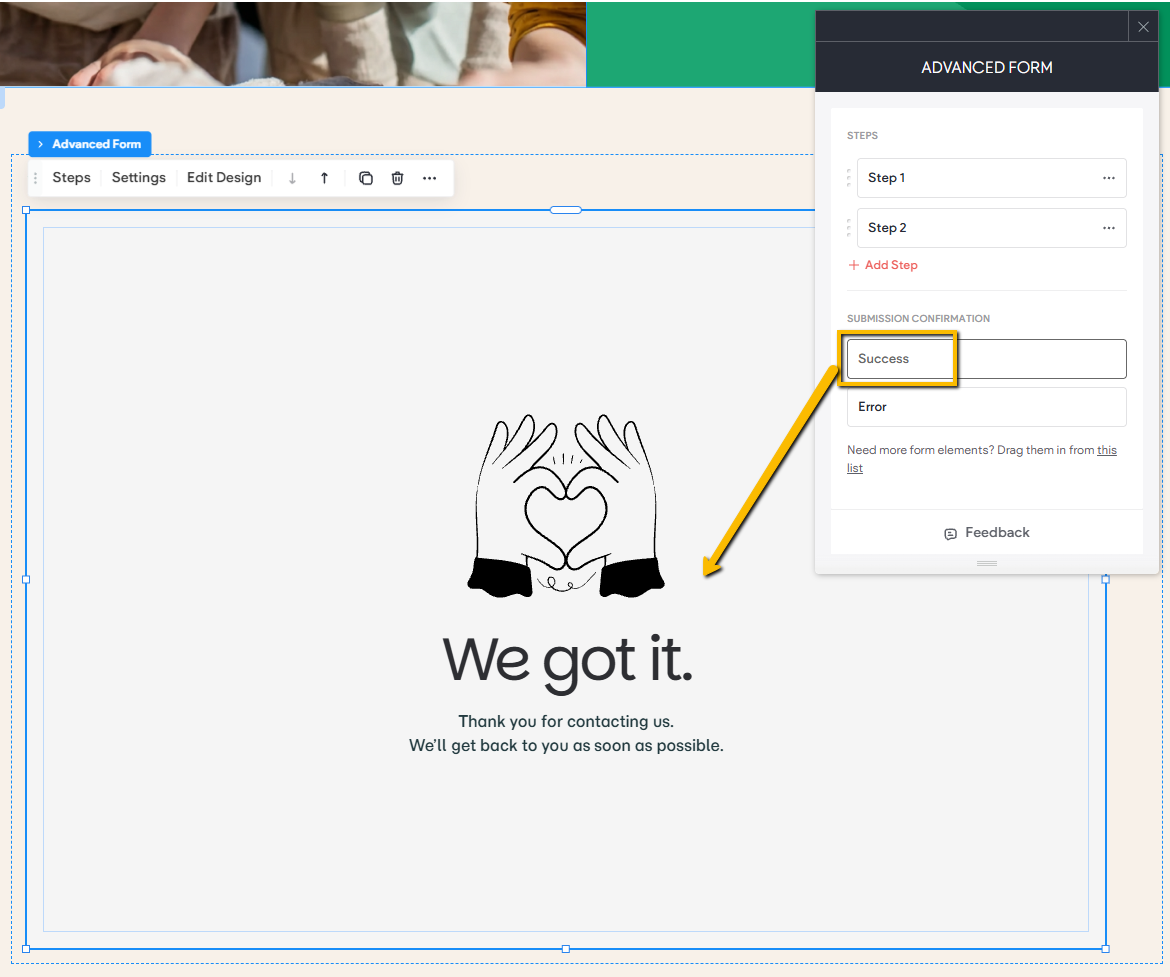
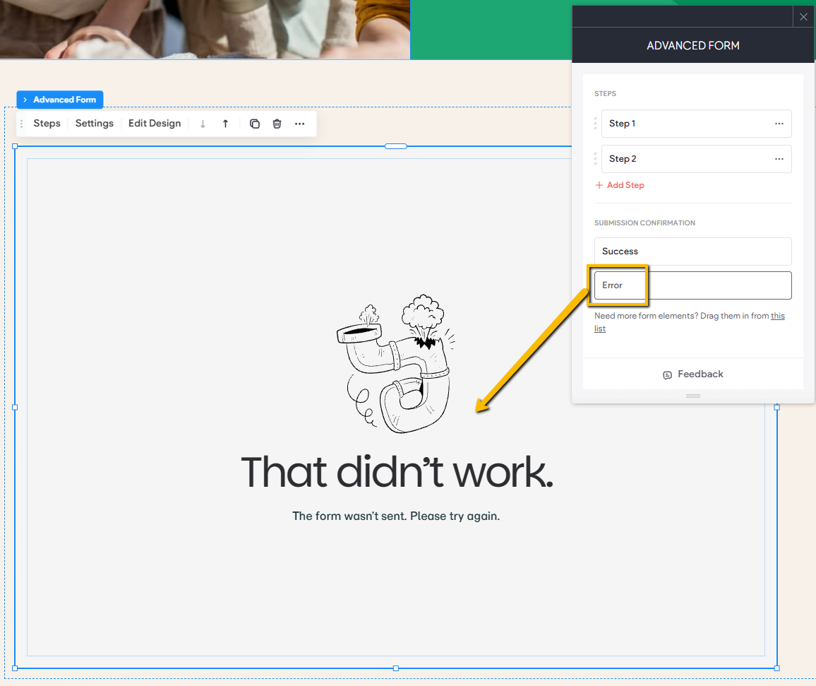
Submission Confirmation
These settings control what visitors see after attempting to submit the form.
- Thank You Message: Displayed after a successful submission. Customize this screen to confirm the form was received and provide next-step guidance.
- Error Message: Shown if the submission fails. Personalize this message to help users fix the issue and try again.
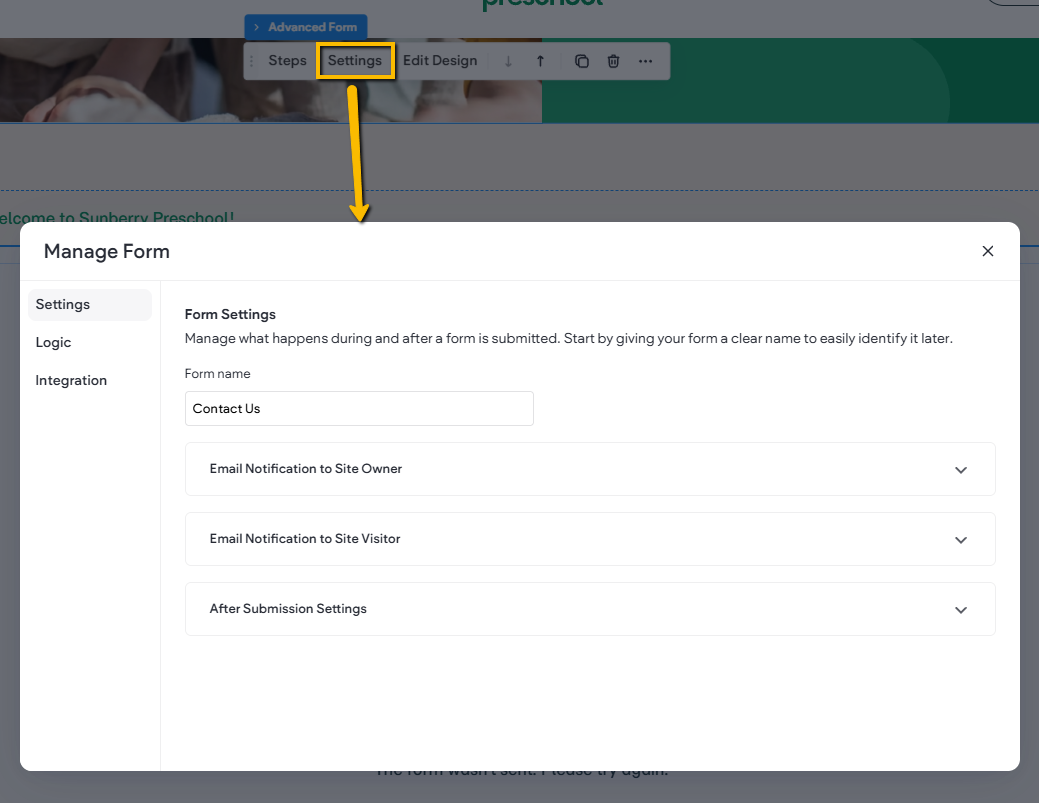
FORM SETTINGS
The Settings window includes all configuration options for handling form submissions, logic and integrations.
Settings: This tab controls the following aspects of the form:
• Form Name: Sets the name of the form
• Email Settings: Control the email notifications sent to both the site owner and the form submitter, including sender details, subject line, and recipient addresses.
• After Submission Settings: Choose what happens after a user submits the form. Redirect to a specific page on the site or send them to an external URL.
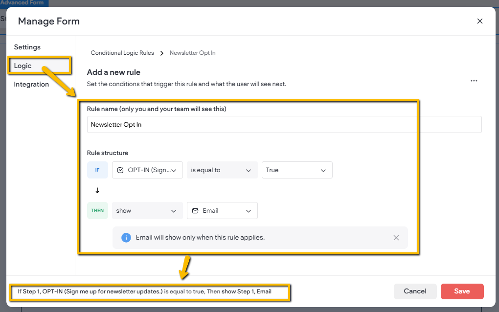
Logic
The Logic tab allows you to create conditional rules that show, hide, or modify form fields based on a user's responses. This helps streamline the form experience by displaying only the fields that are relevant to each user.
Rule Name
Use this field to assign a name to the rule for easy identification and management.
IF Rule
The IF section defines the condition that must be met before an action is triggered.
- IF Field: Select the field that will be evaluated.
- IF Condition: Define the condition that must be met within the selected field.
- IF True/False: Specify whether the condition must evaluate as True or False for the rule to proceed.
THEN Rule
The THEN section defines the action that will occur when the IF condition is met.
- THEN Action: Select the action to perform when the rule is triggered.
- THEN Field: Select the field that will be affected by the action.
Example:
Suppose your form contains a checkbox asking users if they would like to receive newsletter updates.
To display an email field only when the user opts in:
- Set the IF Field to the newsletter opt-in checkbox.
- Set the IF Condition to check whether the checkbox is selected.
- Set IF True/False to True.
- Set the THEN Action to Show Field.
- Set the THEN Field to the email address field.
When the user selects the newsletter opt-in checkbox, the email field will be displayed. If the checkbox is not selected, the email field will remain hidden. A rule summary will also be displayed at the bottom of the window, providing a clear overview of how the form's conditional logic is configured and functions.
The completed rule would look like this:
IF > OPT-IN > is equal to > True
↓
THEN > show > Email
MODIFYING THE FORM LAYOUT & CONTENT
The Advanced Form widget gives you full control over how your form looks and how information is organized.
• Adding New Fields: Open the widgets panel, locate the Form Elements category, and drag the fields you want directly into your form.

• Editing Form Elements: Select any element to access its Content settings, where you can update its text, settings, and behavior.

• Adding Widgets: Drag any widget from the panel and drop it into the form. Once placed, you can position and organize it just like content inside a standard column.

• Rearranging Content: Resize or move elements within the form the same way you would manage any content in a regular column layout, giving you maximum flexibility in design.

DESIGN SETTINGS
The Advanced Form widget does not include its own unique styling controls beyond basic layout and sizing. Each widget added inside the form, whether a form field or any other widget, includes its own individual content and design options. This allows you to control the look and feel of every element independently.
