Reviews Showcase

The Reviews Showcase widget makes it easy to present reviews or testimonials in polished, pre-styled layouts. Add names, feedback, and star ratings without worrying about design, or connect to a collection for spreadsheet-style updates that stay in sync with your site.
Preview: https://demo.wocode.com/reviews-showcase
Tutorial Video
SETUP
WIDGET PLACEMENT
- Drop the widget onto your site and place it in a row where you would like the reviews showcase to be seen.
WIDGET OPTIONS
- Open the widget option panel.
-
Show Quote On: This option determines how reviews showcase will behave when the widget is interacted with. There are two available choices:
• Click: A new quote will be displayed when that quote is clicked.
• Hover: A new quote will be displayed when it is hovered over.
-
Quotes List: Within this section, you can add quotes along with their corresponding details. Each list item offers multiple options for managing the quote.
• Quote Author: The name of the author that will be displayed for that quote.
• Author Avatar: The image representing the author of the quote.
• Author Description: Information about the author, such as their place of work and job title.
• Quote Title: The title associated with the quote.
• Quote Content: The actual quote itself.
• Rating: Applies a star rating (0-5 stars) to the quote. Zero stars disable this field within that specific quote.
-
Enable Animation: When enabled this will make the quotes animate into view.
-
Animation Mode: This option allows you to choose the animation type. There are two available choices:
• Sync: Animates all the quote content simultaneously.
• Delayed: Animates the quote content with delays, one after another.
-
Animation Duration: This setting determines the length of time it takes for the animation to fully animate the content.
-
Delay Amount (ms): This setting only works when the animation mode is set to "Delayed". It causes the quote content to appear sequentially (one by one).
-
Autoplay: When enabled, the widget will automatically cycle through and display each quote without requiring user interaction. There are two available options for this setting:
• Pause On Hover: When enabled, autoplay will pause while the user hovers over the widget.
• Autoplay Delay (ms): This setting determines the length of time before the next quote is loaded into view when the AutoPlay option is enabled.
DESIGN SETTINGS
The Design section allows you to customize the look and feel of the Reviews Showcase. Most of these options are related to padding and text styling and are self explanatory, however there are a number of design options worth mentioning specifically.
-
Widget Styling: In this section, you’ll customize the appearance of the widget and its container. There are several options to choose from here:
• Border: Applies a border around the widgets container.
• Corner Radius: Applies a rounded edge to the border.
• Sidebar Position (Desktop/Tablet): Adjusts the position of the sidebar that shows author information. Options include left, right, up, and down.
• Sidebar Width: Sets the width of the sidebar.
• Sidebar Gap: Creates spacing between the sidebar and the content.
-
Buttons Styling: Customize the look of buttons within the widget.
• Button Gap: Adjusts the space between buttons.
• Minimum Button Width (px): Sets the width of each button.
• Button Vertical Padding (px): Adjusts the padding above and below the buttons.
• Button Horizontal Padding (px): Adjusts the padding on the left and right sides of the buttons.
• Animate Image Colors: Use this toggle to enable or disable the grayscale effect and color animation that appears when hovering over the author image.
• Image Width (px): Sets the width of the author image.
• Image Height (px): Sets the height of the author image.
-
Content Styling: Customize the look of content within the widget.
• Content Container Minimum Height: Sets the behavior of the container's minimum height. There are two options:
• Auto: Automatically adjusts the minimum height of the content container based on the amount of content present.
• Custom: Allows you to set a custom minimum height for the content container, applied to all content within the widget.
• Minimum Content Height (px): When "Custom" is selected, this option lets you define a specific minimum height (in pixels) for all content within the widget.
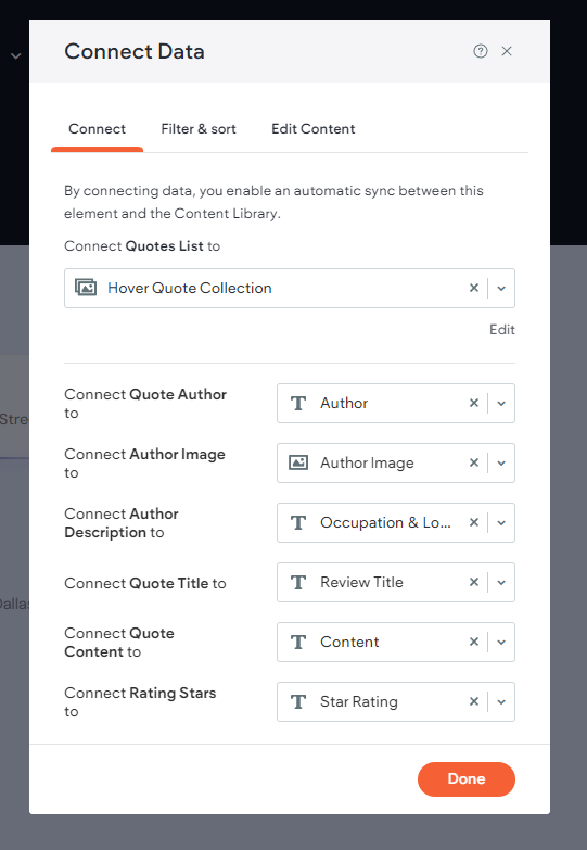
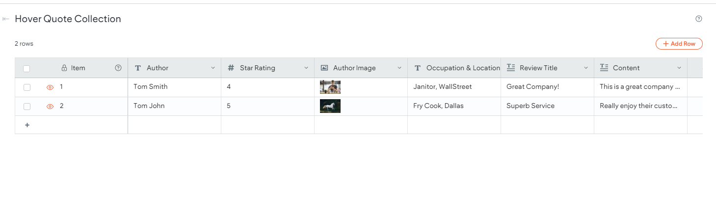
CONNECTED CONTENT
The Reviews Showcase widget can be populated using connected content through an internal collection. To achieve this, use the following steps:
- Create an internal collection (Content > Collections > + Add Collection > Internal Collection).
-
Create the following fields that will be used within the widget:
• Text (used for Quote Author)
• Number (used for Star Rating)
• Image (used for Author Image)
• Text (used for Author Description)
• Rich Text (used for Quote Title)
• Rich Text (used for Rating Stars)
- Right click Reviews Showcase widget and select Connect to Data.
-
Select the internal collection from the dropdown list and connect the appropriate fields to the widget.