Site Editor Overview
The Without Code site editor is made up of four main sections: the top toolbar, the left sidebar, the right design bar, and the main content area. In this training document, we’ll explain what each section does and how they work together to help you build and manage your site.
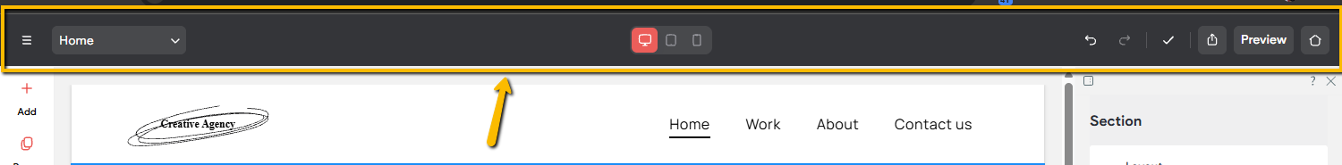
Top Toolbar
The top toolbar gives you access to essential controls for navigating your site, switching device views, sharing, previewing, and more. Below is a breakdown of what each button in the toolbar does.
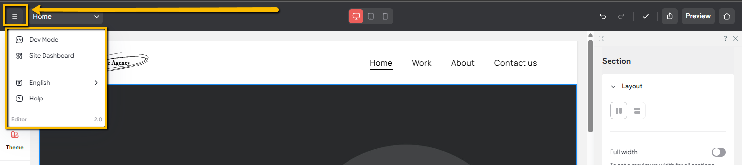
Hamburger Menu
The hamburger icon opens a dropdown menu with the following options:
• Dev Mode: An advanced feature that allows direct access to your site’s code. This is best suited for users with coding experience. It is recommended to create a site backup, found in the Settings tab, before making any code changes.
Please Note: We are unable to provide support for, or troubleshoot custom or modified code.
• Site Dashboard: Opens your site dashboard, where you can view site statistics, update SEO and AEO metadata, manage blog metadata, and more. For additional details, refer to the Site Overview training document.
• Language: Changes the language of the editor interface. To update the language displayed on your live site, use the Site Languages option in the site settings.
• Help: Provides access to documentation and guides covering different parts of the builder, including widgets and core features.
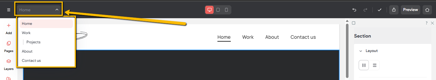
Page Picker
The page picker opens a dropdown list of all pages on your site, making it easy to jump between them. You can also type directly into the bar to quickly find a specific page, which is especially useful for larger sites with many pages. Pages are shown in the same structure as the Pages panel, with subpages nested under their parent pages.
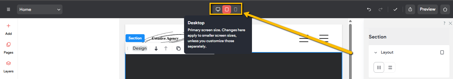
Device Layout
The device layout buttons let you switch between desktop, tablet, and mobile views in the builder. This allows you to see how your site appears on each device type and make device-specific adjustments to ensure your site looks great across all screen sizes.
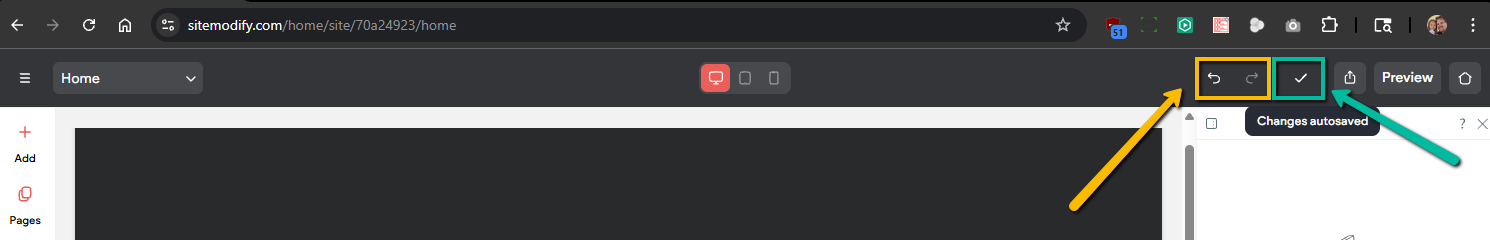
Undo/Redo & Save State
The undo and redo buttons let you quickly reverse or reapply recent changes made to your site. The save state indicator shows whether your changes have been saved. A checkmark means your site is fully saved, while an animated three-dot indicator shows that a save is currently in progress.
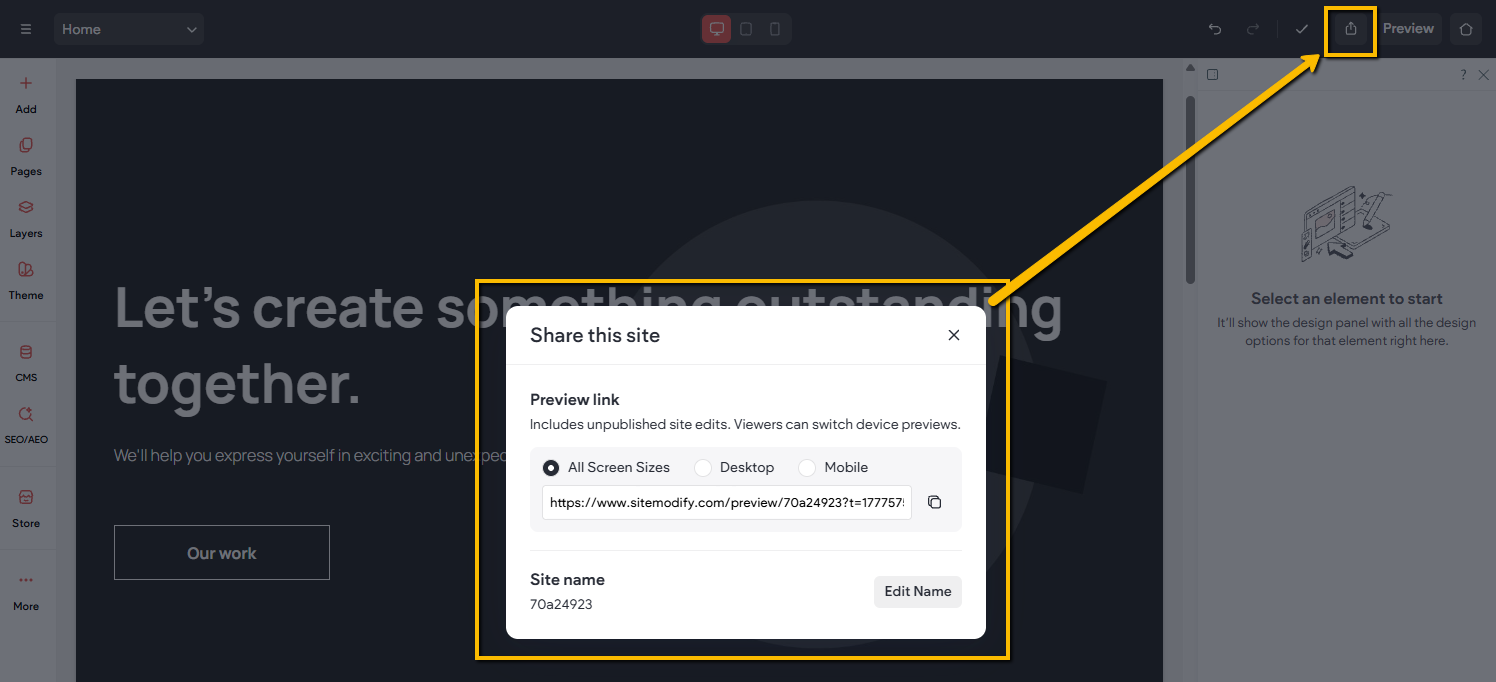
Share Button
The share button opens a window that lets you quickly copy your site’s preview URL. You can choose to share all screen sizes at once, or share a specific view such as desktop or mobile.
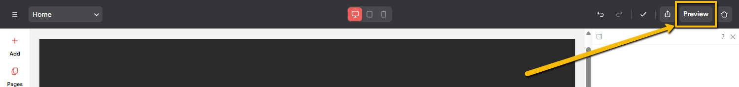
Preview Button
The preview button lets you view your site directly inside the builder without leaving the editor. In preview mode, you can control which device and screen size you want to test, allowing you to see exactly how your site will appear across different layouts.

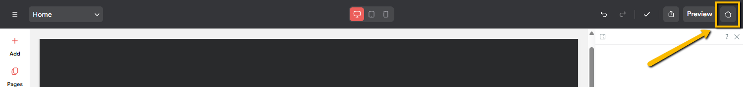
Home Button
The home button provides a quick way to go to your site list from within the builder.
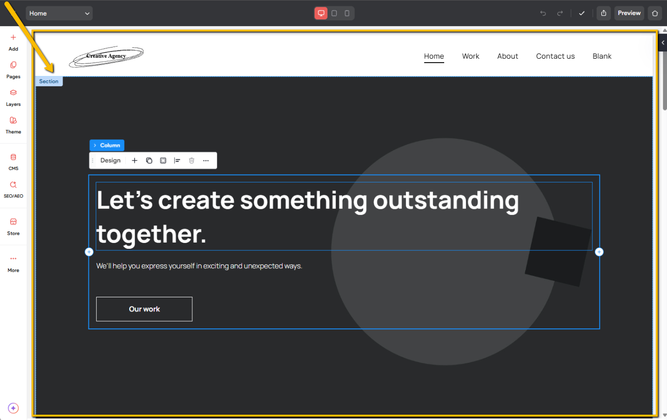
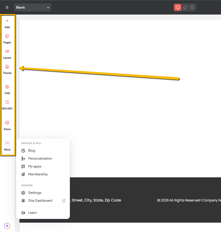
Left Sidebar
The left sidebar contains all widgets and features that apply across your entire site. From here, you can adjust global design settings, add or edit pages, manage site themes, work with dynamic content, import content, add features both large and small, and make administrative changes, along with other site-wide settings.
For a complete walkthrough of the left sidebar, including each tab and its functionality, see our training document here.
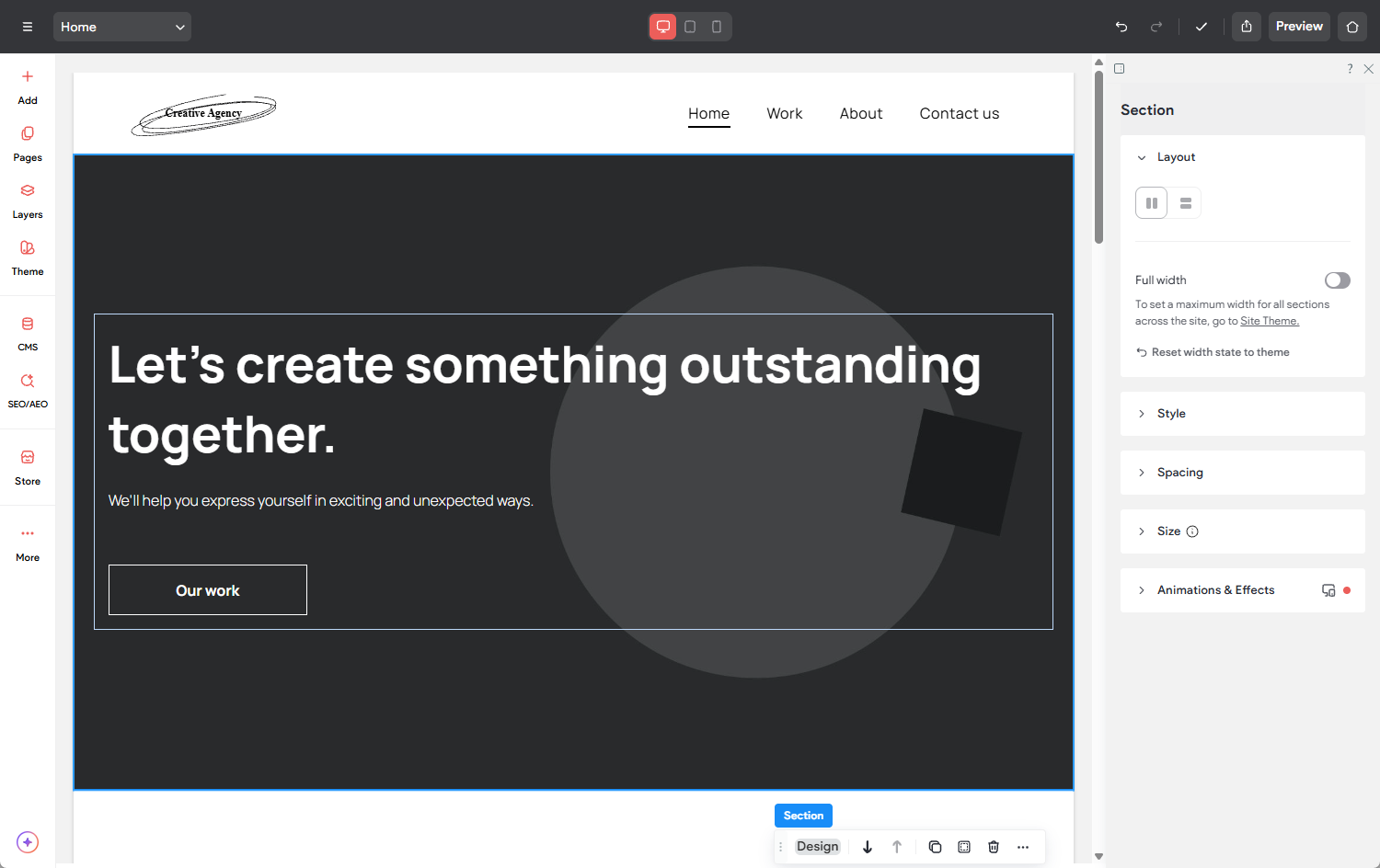
Design Panel (Editor 2.0)
In Editor 2.0, the Design panel will appear on the right side of the builder when you click on any page element. This is where you can style and design site elements and widgets. Each element and widget will contain its own unique options specific to the element.
Note that this right-side toolbar is only present in Editor 2.0. In the Classic editor, these settings can be found in the widget settings, under the Design tab.
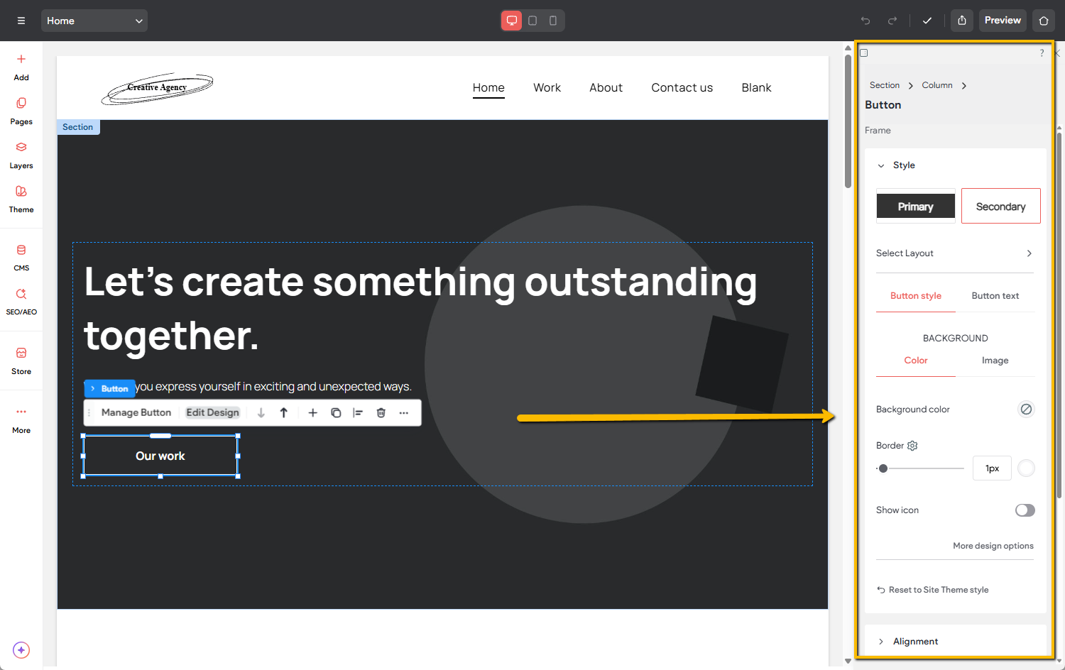
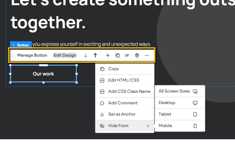
Context Menu (Editor 2.0)
The context menu appears whenever you select an element or widget on the page. It provides quick access to actions such as editing content, adjusting design settings, rearranging elements, duplicating, and other common editing options.
Note that this context menu is only present in Editor 2.0. In the Classic editor, these settings can be found in the widget settings.
Content Area
The main content area located in the center of the screen, is where you edit the elements on your site. Here, you can update images, add text, and customize each element by selecting it and adjusting its settings to match your design and content needs. You can also rearrange elements by dragging them, hide them using the three-dot menu, duplicate them, and make all the changes needed to build out your site.